Stem‐and‐leaf displays are useful for displaying the relative density and shape of the data, giving the reader a quick overview of distribution. They retain (most of) the raw numerical data, often with perfect integrity. They are also useful for highlighting outliers and finding the mode. However, stem‐and‐leaf displays are only useful for moderately sized data sets (around 15–150 data points). With very small data sets a stem‐and‐leaf displays can be of little use, as a reasonable number of data points are required to establish definitive distribution properties. A dot plot may be better suited for such data (Example 8.1). With very large data sets, a stem‐and‐leaf display will become very cluttered, since each data point must be represented numerically. A histogram or boxplot may become more appropriate as the data size increases.
Histogram
A histogram is a more compact summary of data than a stemplot. A histogram is an accurate representation of the distribution of numerical data. It is an estimate of the probability distribution of a continuous variable (quantitative variable) and was first introduced by Karl Pearson (1895). It differs from a bar graph, in the sense that a bar graph relates two variables, but a histogram relates only one. To construct a histogram, the first step is to “bin” the range of values – that is, divide the entire range of values into a series of intervals – and then count how many values fall into each interval. The bins are usually specified as consecutive, nonoverlapping intervals of a variable. The bins (intervals) must be adjacent and are often (but are not required to be) of equal size (Howitt and Cramer 2008).
If the bins are of equal size, a rectangle is erected over the bin with height proportional to the frequency – the number of cases in each bin. A histogram may also be normalized to display “relative” frequencies. It then shows the proportion of cases that fall into each of several categories, with the sum of the heights equaling 1.
However, bins need not be of equal width; in that case, the erected rectangle is defined to have its area proportional to the frequency of cases in the bin (Freedman et al. 1997). The vertical axis is then not the frequency but frequency density – the number of cases per unit of the variable on the horizontal axis. Examples of variable bin width are displayed on Census bureau data (Freedman et al. 1997). As the adjacent bins leave no gaps, the rectangles of a histogram touch each other to indicate that the original variable is continuous (Stangor 2011).
Histograms give a rough sense of the density of the underlying distribution of the data, and often for density estimation: estimating the probability density function of the underlying variable. The total area of a histogram used for probability density is always normalized to 1. If the lengths of the intervals on the x‐axis are all 1, then a histogram is identical to a relative frequency plot.
Once the number of bins and the lower and upper boundary of each bin have been determined, the data are sorted into the bins and a count is made of the number of observations in each bin. To construct the histogram, use the horizontal axis to represent the measurement scale for the data and the vertical scale to represent the counts, or frequencies. Sometimes the frequencies in each bin are divided by the total number of observations (n), and then the vertical scale of the histogram represents relative frequencies. Rectangles are drawn over each bin, and the height of each rectangle is proportional to frequency (or relative frequency). Most statistics packages construct histograms.
EXAMPLE 8.4
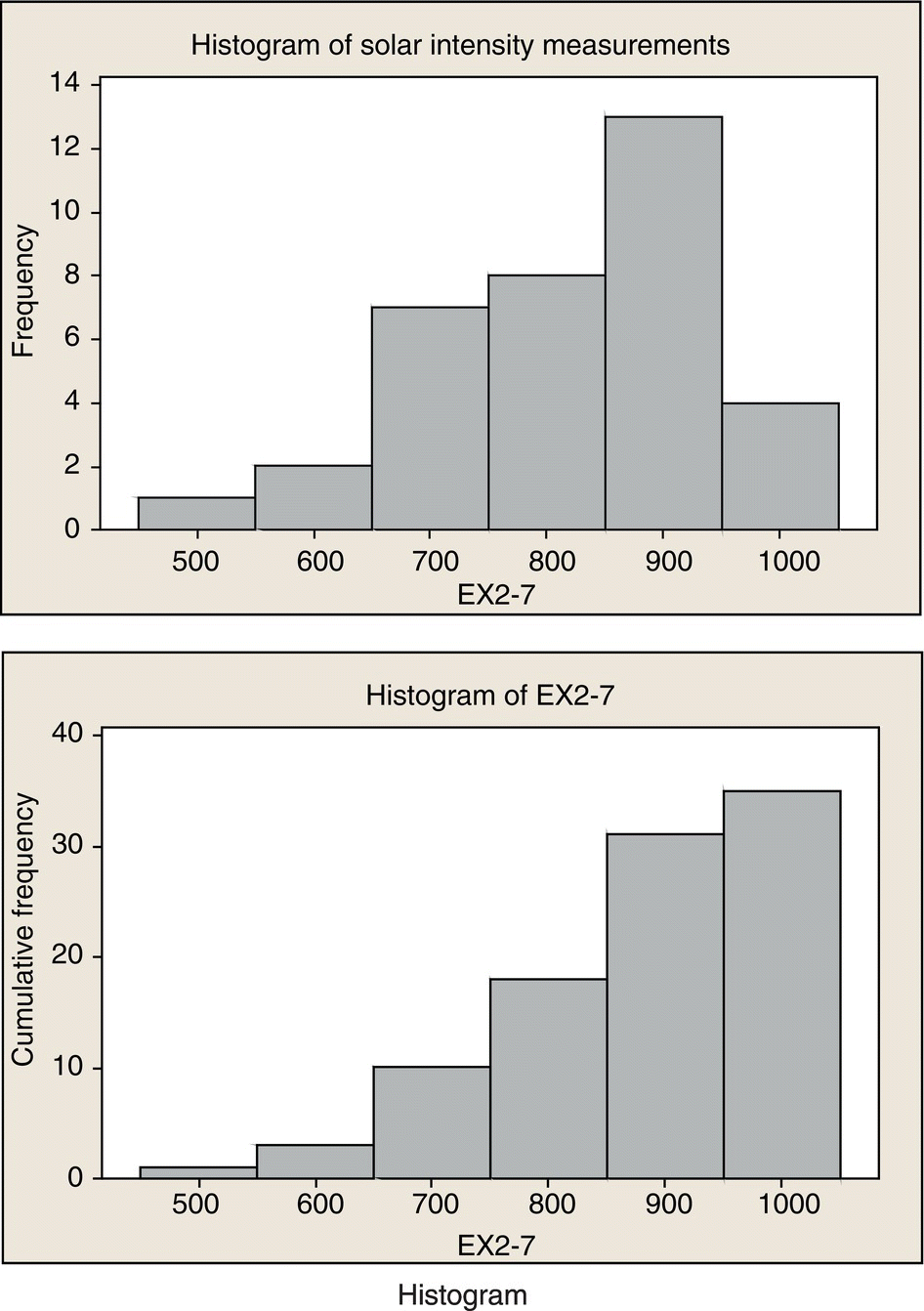
Construct a cumulative frequency plot and histogram for the solar intensity data in Example 8.2. Use six bins.
SOLUTION
For six bins

Histogram
Pareto Diagram
A Pareto Diagram is an important variation of the histogram. A Pareto Diagram is named after the Italian economist Vilfredo Pareto, and they usually exhibit Pareto principle, that is, most of the defects can usually be accounted for by a few of the categories. The Pareto principle essentially states that 80% of the effect is caused by 20% of the causes (commonly called 80/20 rule or “the vital few and the insignificant many”). The Pareto chart organizes data to show which items or issues have the biggest impact on the process or system. Then, on the chart, we stratify the data to show the groups, starting with the largest and working down to the lowest number of items in each group. The idea is that by organizing the data in this format, we can develop a plan to work to work on problems that will give us the biggest return for our process improvement efforts.
The sole purpose of the Pareto chart is to highlight the most important among a (typically large) set of factors. Using the chart, one can identify the vital 20% factors causing the majority of the defects. In quality control, it often represents the most common sources of defects, the highest occurring type of defect, or the most frequent reasons for customer complaints, and so on (Montgomery 1985; Tague 2004). Wilkinson (2006) devised an algorithm for producing statistically based acceptance limits (similar to confidence intervals) for each bar in the Pareto chart. Pareto chart can also help in the SPC of zeroing the cause and effects in a manufacturing process toward achieving the ideal of “zero defect and zero effect.”
EXAMPLE 8.5
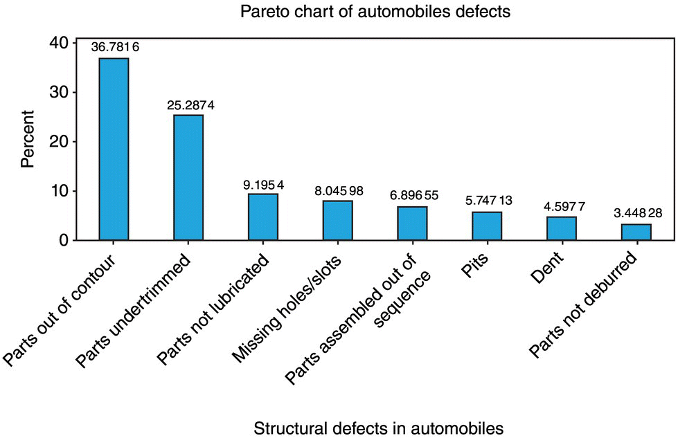
The following information on structural defects in automobile doors is obtained: dents, 4; pits, 4; parts assembled out of sequence, 6; parts under‐trimmed, 21; missing holes/slots, 8; parts not lubricated, 5; parts out of contour, 30; and parts not deburred, 3. Construct and interpret a Pareto chart.
SOLUTION
Roughly 63% of defects are described by parts out of contour and parts under trimmed.

Leave a Reply