Among the many percentiles, a particular role is played by the quartiles, denoted by Q1, Q2, and Q3, corresponding to 25%, 50%, and 75%, respectively. Clearly, Q2 is simply the median. A look at these values and the mean tells a lot about the underlying distribution. Indeed, the interquartile range

has been proposed as a measure of dispersion, and an alternative measure of skewness, called Bowley skewness, is

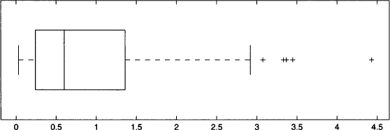
The three quartiles are the basis of a common graphical representation of data, the boxplot (also known as a “whisker diagram”). A boxplot is shown in Fig. 4.11. In the picture you may notice a box. The line in the middle of the box corresponds to the median, whereas the two edges of the box correspond to the lower and upper quartiles. Dashed lines are drawn connecting the box to two fences. The two fences should be two bounds on the “normal” values of the observed variable. Any point beyond those fences is a potential outlier.

Fig. 4.11 A boxplot with outliers.
You will not be surprised to learn that there are alternative definitions of fences, and several variations on boxplots. One possible choice is to tentatively place the lower and upper fences at points

respectively. Points beyond such fences are regarded as outliers and are represented by a cross. If there is no outlier above the upper fence, this is placed corresponding to the largest observation; the lower fence is dealt with similarly. In Fig. 4.11 a dataset consisting of positive values is represented; since no observation is flagged as an outlier on the left part of the plot, the lower fence corresponds to the smallest observation, which is close to zero.
Leave a Reply